
Setting up an e-commerce website is easy. Setting up one that sells is a different job, and it comes down to about nine decisions: your domain, your platform, your product pages, your photography, your proof, your payments, your checkout, your delivery, and your speed.
If you are reading this you almost certainly already have a business. You may already have a shop online that is quieter than it should be. This is not a guide to registering a company or working out what to sell, because you have done that. It is the website side, which is the part we do for a living.
E-commerce website setup is the work of turning a platform account into a shop that takes orders: the pages, the payment route, the delivery rules and the trust signals that make a stranger comfortable typing their card in. Most shops get the platform right and then stop, which is why most shops underperform.
Nine tips, in the order we would work through them with a client.
Key Takeaways
- Pick the platform category, not the brand. Inside a category the products are more alike than the marketing suggests.
- Your own photographs beat supplier images every time. Stock product shots are the clearest signal that a shop is a reseller with nothing to add.
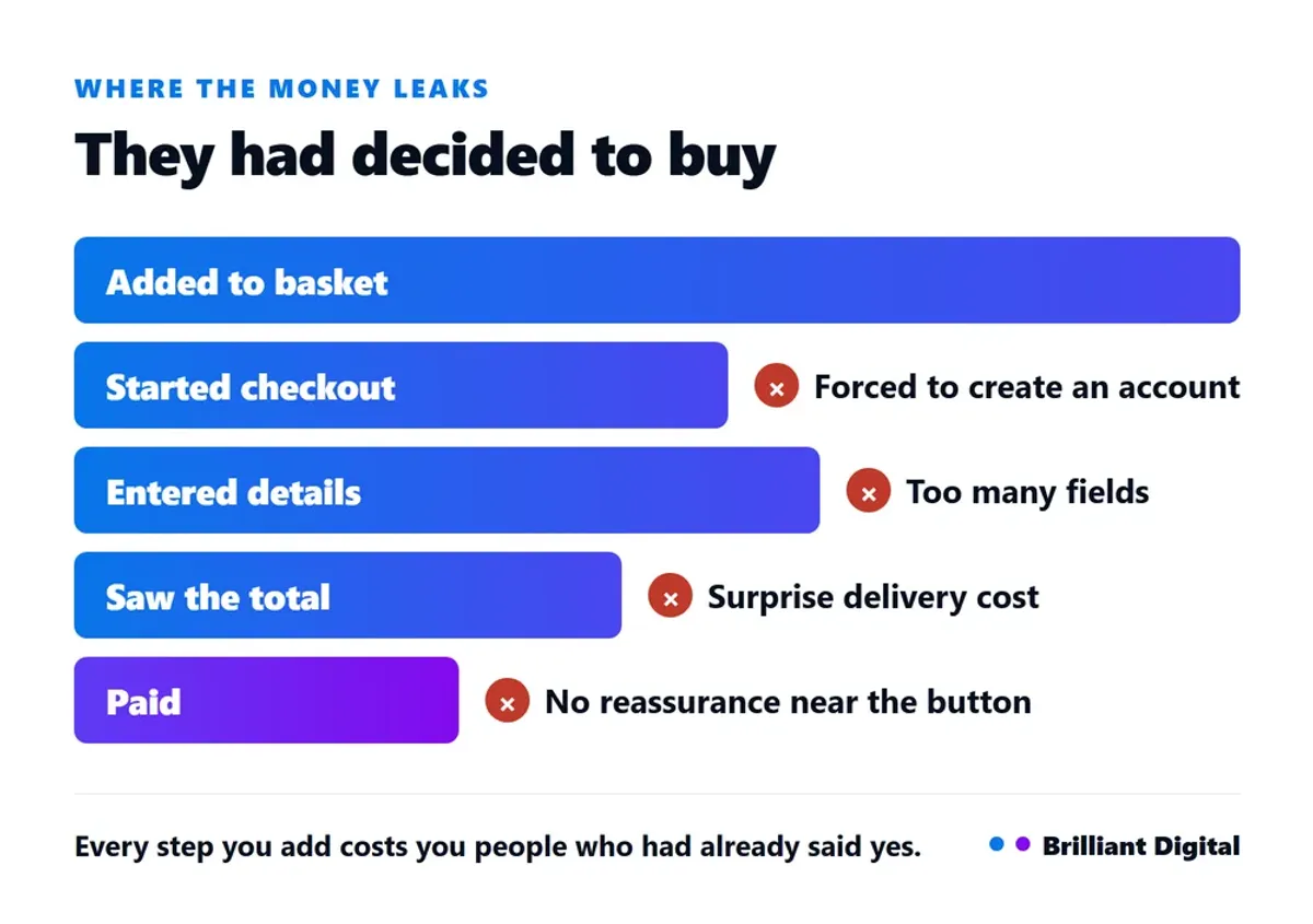
- Checkout is where the money leaks. Forced accounts, surprise postage and too many fields each cost you people who had already decided to buy.
- Delivery and returns are selling tools, not admin. Stated clearly and early they close sales; buried in a policy page they lose them.
- Speed is a conversion problem, not a technical one. A slow product page loses people before they see the product.

1. Sort the domain before anything else
Your domain is the one decision that is genuinely hard to reverse, so settle it first. Short and easy to say out loud beats clever. A .co.uk signals a UK business to UK buyers, and owning both the .co.uk and the .com and pointing one at the other costs very little.
If you already have a domain you are not happy with, changing it is possible but it is a project rather than an afternoon. You keep the old one, redirect every page to its match on the new one, and accept a temporary dip in search visibility while Google catches up. Far better to do that at forty products than at four hundred.
One practical thing people miss: buy the obvious misspellings and the hyphenated version if they are cheap, and point them at your real domain. It costs a few pounds a year and stops somebody else trading on your name.
2. Choose the platform category, not the brand
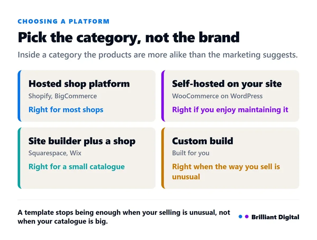
Pick the category that matches how you actually sell, then pick a product inside it. Most people do this backwards and spend a fortnight comparing feature lists across categories that were never right for them. There are four, and the choice between them matters far more than the choice within them.
- A hosted shop platform (Shopify, BigCommerce and similar). You rent it monthly and it does one job: run shops. Payments, tax, shipping rules and stock are handled, and somebody else patches the security. Right for most shops.
- Self-hosted on your own website (typically WooCommerce on WordPress). You own the whole stack and you maintain it. Cheaper in licence fees, not cheaper in time. Right if you already run WordPress and somebody enjoys the technical side.
- A website builder with shop features (Squarespace, Wix and similar). Strong design tools, simpler selling. Right when the shop supports the brand rather than being the business.
- A custom build. Right when you have a constraint a template cannot express: complex product configuration, an integration with your stock or accounting system, a subscription model, or different pricing per trade customer.
A template stops being enough when the way you sell is unusual, not when your catalogue gets big. Plenty of shops with thousands of products run happily on a template. A shop with forty products and a made-to-measure ordering process does not.
If you are already on a platform and it is fighting you, work out which of those four you actually needed before you migrate. Moving between two hosted platforms rarely fixes a problem that was really about category.
3. Write product pages that answer the real questions
A product page converts when it answers, on the page, what a customer would have asked a person in a shop. Most pages describe the item and stop there. The ones that sell handle the doubts as well: will this fit, when will it arrive, what if it is wrong, and who am I actually buying from.
Every product needs its own description, not the supplier's copy that forty other shops are also running. Write it for the person who is nearly convinced, because that is who is reading. Answer the sizing question, the compatibility question and the "what is in the box" question.
The fastest way to find what is missing is your own inbox. The questions people email you before they buy are the questions your product page failed to answer. Read the last twenty and put the answers on the page.
While you are rewriting them, fix the search side at the same time. Every product needs its own page title and its own description, written in the words a customer would type rather than the manufacturer's part number. Duplicated titles across a catalogue are one of the most common reasons a shop's products never appear in search, and it is a tedious fix rather than a difficult one.
If writing this sort of copy is not something you enjoy, our guide to website copy that gets enquiries covers the same ideas applied across a whole site.
4. Use your own photographs
Supplier stock images are the single clearest signal that a shop is a reseller with nothing to add. Your phone in daylight against a plain wall beats a catalogue render, because it looks like the product exists in somebody's hands rather than in a warehouse somewhere.
You need fewer shots than you think, but you need the right ones: the product on its own, the product in use or worn, a close-up of whatever the quality argument rests on, and something that shows scale. Scale is the one people forget, and it is the reason a lot of things get returned.
Shoot everything against the same background in the same light. Consistency across a catalogue looks deliberate in a way that individually nicer but mismatched photographs never do.

5. Put your proof where the doubt is
Proof works when it sits next to the claim that triggers doubt, not on a separate testimonials page most visitors never open. Move the review next to the product it refers to, and the delivery promise next to the buy button. That is where the hesitation actually happens.
Different doubts need different social proof, so match the evidence to the worry:
- "Can they actually do this?" Photographs of real work, the number of orders shipped, how long you have been trading.
- "Will it turn up?" Delivery times stated plainly, a real address, a phone number somebody answers.
- "What if it is wrong?" Returns terms in plain words, near the button rather than three clicks away.
Recency matters as much as placement. A wall of reviews where the newest is three years old reads worse than four from this year, because the reader is not only asking whether you were good, they are asking whether you still are. There is more on this in our guide to building credibility with testimonials and reviews.
6. Set payments up so they cost you less and convert more
Offer the card payments your platform provides plus at least one wallet option, because wallets remove the typing and typing is where mobile buyers give up. Every route costs a percentage plus a small fixed fee per transaction, and those rates change, so check the provider's own pricing page rather than a blog post.
Two things worth getting right at setup:
- Take the fixed fee seriously on low-value orders. A fixed pence-per-transaction charge is trivial on a £200 order and material on a £6 one. If you sell low-value items that fee belongs in your pricing, and it is an argument for a minimum order or a bundle.
- Turn the fraud tools on before you need them. Every platform has them. They cost nothing until they save you a chargeback, and a chargeback costs more than the order.
Not sure which of these nine your shop is actually failing on? Buy something from yourself, on your own phone, start to finish, and count every moment you hesitate. Those are your problems, in priority order. If you would rather somebody else did that properly, tell us about your shop and we will come back honestly about what we would change.
7. Strip the friction out of checkout
Checkout is where the money is actually lost, because everybody who reaches it has already decided to buy. Your job here is to remove reasons to stop, not to add features. Four things do most of the damage, and all four are settings rather than redesigns.
- Forcing account creation. Offer guest checkout. Invite them to create an account after they have paid, when it costs them nothing.
- Surprise delivery cost. If postage appears for the first time at the final step, you have re-opened a decision the customer thought they had made.
- Too many fields. Ask for what you need to take the money and ship the thing. Nothing else.
- No reassurance at the payment step. Returns terms and contact details belong near the button.
Switch on abandoned basket emails. Most platforms will contact somebody who got as far as the basket and left. It is one of the few things you configure once and benefit from indefinitely.
8. Make delivery and returns a reason to buy
Delivery pricing is a positioning decision, not an admin one. A free-delivery threshold raises average order value and is easy to understand. Flat rate is honest and simple. Charging exact carrier cost is the most accurate and the most likely to lose the sale. Pick one and state it on the product page, not at checkout.
Returns work the same way. Under UK distance selling rules a customer has 14 days from delivery to cancel, another 14 to return the item, and you refund within 14 days of getting it back (GOV.UK). You are going to honour that either way, so you may as well say it clearly and get the credit for it.
Two details that catch people out. If you do not tell customers about the cancellation right, they keep it for 12 months instead of 14 days (GOV.UK). And when somebody cancels you refund the standard delivery charge as well as the item, though if they paid extra for a faster option you only owe the standard rate.

9. Fix speed and mobile before you spend on traffic
A slow shop loses people before they see anything, and product pages carrying large uncompressed images are almost always the reason. This matters more on a shop than on an ordinary website, because somebody comparing three tabs will simply close the slow one.
Most people will meet your shop on a phone, one-handed, possibly on a train. If the checkout is awkward with a thumb it is broken, however good it looks on your monitor. Test it on your own phone on mobile data rather than the office wifi.
Get this right before you spend anything on ads. Sending paid traffic to a slow page that does not convert is an expensive way to learn something you could have found out for free. Our guide to improving website speed covers the fixes in order of impact.
While you are in there, check the padlock. A shop showing a "Not Secure" warning in the address bar will not take card details from anyone, and it is a configuration fix rather than a rebuild.
What this costs, and who should do it
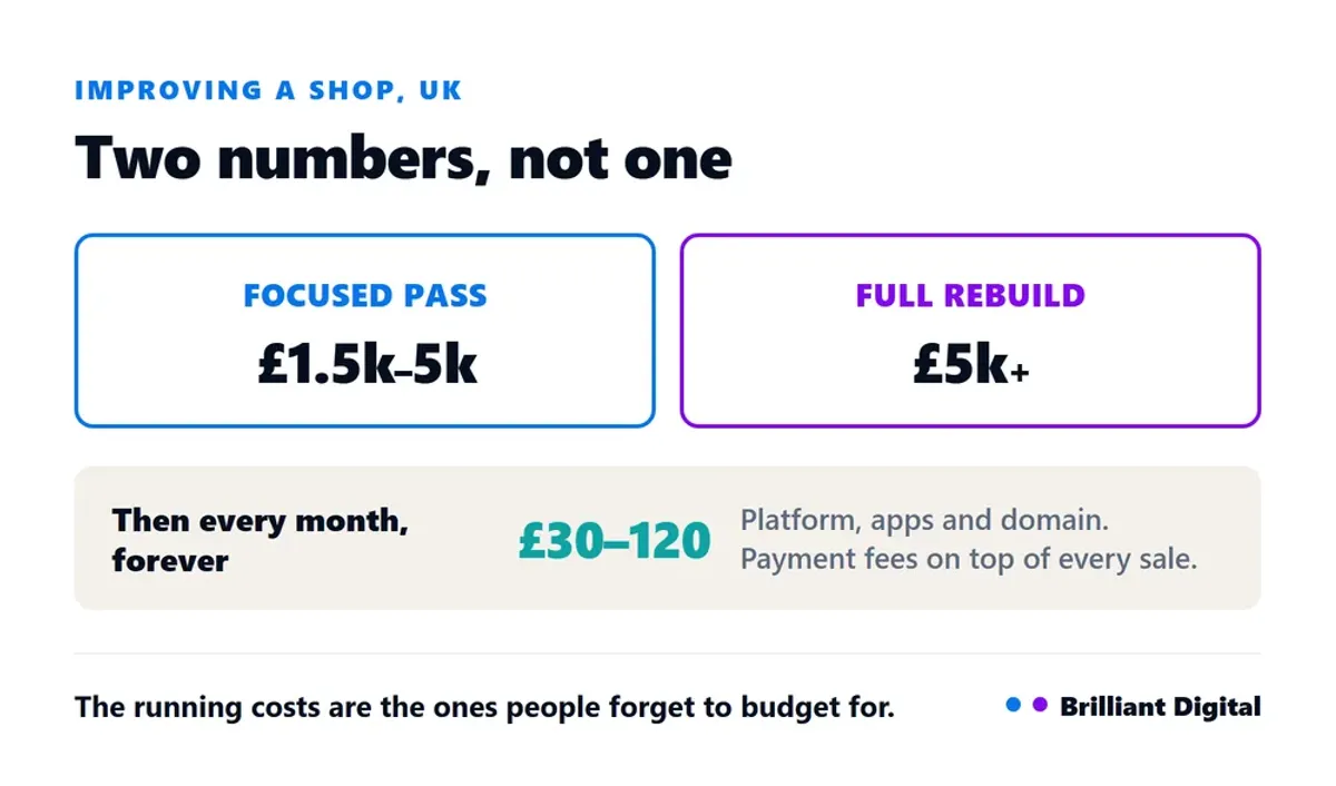
Improving an existing shop is usually a smaller job than people expect, because most of the nine above are configuration and copy rather than a rebuild. A focused pass on product pages, checkout and speed typically costs £1,500 to £5,000. A full rebuild on a new platform is £5,000 upwards.
Running costs sit at roughly £30 to £120 a month for platform, apps and domain, plus payment fees on every order. Those are the ones people forget when they budget.
The honest test for whether you need help: if the nine above are things you understand and simply have not got round to, do them yourself and keep the money for stock. If two or three of them are things you would not know how to judge, that is when an outside pair of eyes pays for itself. If you are weighing up who to use, our guide on choosing a web designer covers the questions worth asking, and what web design costs in the UK sets the wider context on pricing.
We have been building websites since 2014, more than 150 of them, and shops are where small changes show up fastest, because the feedback loop is an order rather than an enquiry. If you would rather it was handled, that is what our ecommerce web design service is for.
Frequently Asked Questions
What do you need for an e-commerce website?
A domain, a platform, product pages with your own descriptions and photographs, a payment method, delivery and returns rules stated clearly, an SSL certificate so the browser does not warn people, and the policy pages required by law. Everything else is an improvement on that base.
How do I get more sales from my existing online shop?
Work through checkout first, because everybody there has already decided to buy. Then product pages and photography, then speed. Those three usually move the numbers before any spend on traffic does, and unlike advertising they keep working once you stop paying attention.
Which e-commerce platform is best?
There is no single best one. Pick the category first: hosted platform, self-hosted, website builder, or custom. Within a category the products are more alike than their marketing suggests, so choose on what your team can realistically maintain rather than on feature lists.
How much does it cost to improve an online shop?
A focused pass on product pages, checkout and speed typically costs £1,500 to £5,000 with a freelancer or agency. A full rebuild is £5,000 upwards. Running costs are separate: roughly £30 to £120 a month for platform, apps and domain, plus payment fees on every order.
Should I move my shop to a different platform?
Only if the problem is genuinely the category rather than the setup. Migrating between two hosted platforms rarely fixes something that was really about product pages or checkout. Work out which of the nine above is failing before you commit to a migration.
What to do next
Start by buying something from your own shop on your own phone. Pay for it properly. Count every moment you hesitate, every field you resent typing, and every question you had to go looking for. That list, in order, is your priority list, and it costs nothing to produce.
If two or three items on it are things you would not know how to fix, that is what our ecommerce web design service is for. Tell us about your shop and what it is currently doing, and we will come back honestly about what we would change first. No lengthy proposal, no hard sell.