Most small business websites are honest, tidy, and completely silent. They describe the business accurately. They just never persuade anyone to send an enquiry.
Website content writing, or website copy, is the words on your pages that do the selling: your headlines, your service descriptions, your buttons, your FAQs. Get it right and a modest website out-performs a beautiful one. Get it wrong and no amount of design rescues it.
The advice you will find elsewhere is not wrong. Know your audience. Use benefits, not features. Write a clear call to action.
All true. And all repeated so often it has stopped meaning anything.
What almost nobody shows you is the web copy actually being rewritten. So that is what this article does. Real before-and-after rewrites, the reasoning behind each change, and the two frameworks we use when writing copy for clients.
Key Takeaways
- Your visitor is not interested in your business. They are interested in their problem. Copy that opens with your history loses them in the first five seconds.
- The headline does most of the work. What you do, who it is for, and the outcome. If a stranger cannot answer all three in three seconds, rewrite it.
- Features tell, benefits sell, but only if you do the translation. After every feature, ask "so what does that mean for me?" and write that answer instead.
- Proof belongs next to doubt. A testimonials page nobody visits does nothing. The same testimonial beside the claim it supports changes minds.
- "Get in touch" is not a call to action. It asks for effort without saying what happens next.
- Answer the price question. Saying "from £X" loses the wrong enquiries and wins the right ones.
Why most small business website copy never gets an enquiry
Most small business copy fails because it is written from the inside out. It describes the business, its history and its values, then lists services. The visitor arrives with a problem, finds nothing that speaks to their situation, and closes the tab. Nothing is wrong with the writing. It is aimed at the wrong person.
Three patterns show up again and again:
- The company history opener. "Established in 1998, we are a family-run business dedicated to quality and customer satisfaction." Every word true. None of it about the reader.
- The undifferentiated service list. Eight services in a row with no indication of who each one is for, or which one solves the visitor's actual problem.
- The dead-end ending. A page that builds a reasonable case and finishes with "Get in touch" and a contact form.
The cause is not laziness. It is that you know your business too well. You have forgotten what a stranger does not know, what they are worried about, and what they need to read before they will type their phone number into a box.
That is the gap. Everything below is about closing it.
Start with the one question your visitor is actually asking
Before writing a single sentence, answer two questions: what did this person type into Google, and what must they believe before they will contact you? Everything on the page exists to move them from the first to the second. If a paragraph does not do that, it is decoration.
You do not need a research budget for this. You need three sources you already have:
- Your enquiry inbox. The questions people ask before they buy are the questions your website failed to answer. Read the last twenty enquiries and write down every question that repeats.
- Your own sales conversations. The objection you find yourself handling on every call belongs on the website, answered before it is raised.
- The words customers use. Not your industry's words. If your customers say "leaky tap" and you say "domestic plumbing remediation", write "leaky tap".
This last point matters more than it sounds. People search using their own vocabulary, not yours. Matching their language is both better copy and better SEO, because Google rewards content that genuinely answers the question being asked. It also settles your tone of voice for you: write the way you would explain it to a customer standing in front of you, and the tone takes care of itself.
Write the question at the top of your draft before you write anything else. Every section then has a job: get the reader closer to the answer.
The headline that does most of the work
Your headline has one job: tell a stranger what you do, who it is for, and what they get, before they decide whether to stay. Nielsen Norman Group's eye-tracking research found that exhaustive reading is rare, and that the first two paragraphs must carry the most important information (Nielsen, 2006).
The formula that works is unglamorous:
What you do + who it is for + the outcome.
Here is a real-shaped example. An independent accountant in Lincolnshire:
Before: "Welcome to Hartley & Co. Professional accountancy services you can trust."
After: "Accountancy for Lincolnshire trades businesses that want to stop dreading January."
Look at what changed. "Professional" and "trust" are claims anyone can make, so they carry no information. The rewrite names the customer, so a builder reading it knows immediately this is for them. It names the outcome in the customer's own words, because nobody wakes up wanting "accountancy services", they wake up dreading the tax return.
That sentence is your value proposition, and it belongs at the top of the page in plain words rather than buried three scrolls down in an About section.
The rewrite is also narrower, and that frightens people. It should not. A headline that speaks precisely to the right person beats one that speaks vaguely to everyone. You are not turning work away, you are giving the right visitor a reason to keep reading.
The three-second test: show your headline to someone outside your industry. If they cannot tell you what you do, who for, and what they get, it is not finished.

Benefits over features: the rewrite that changes everything
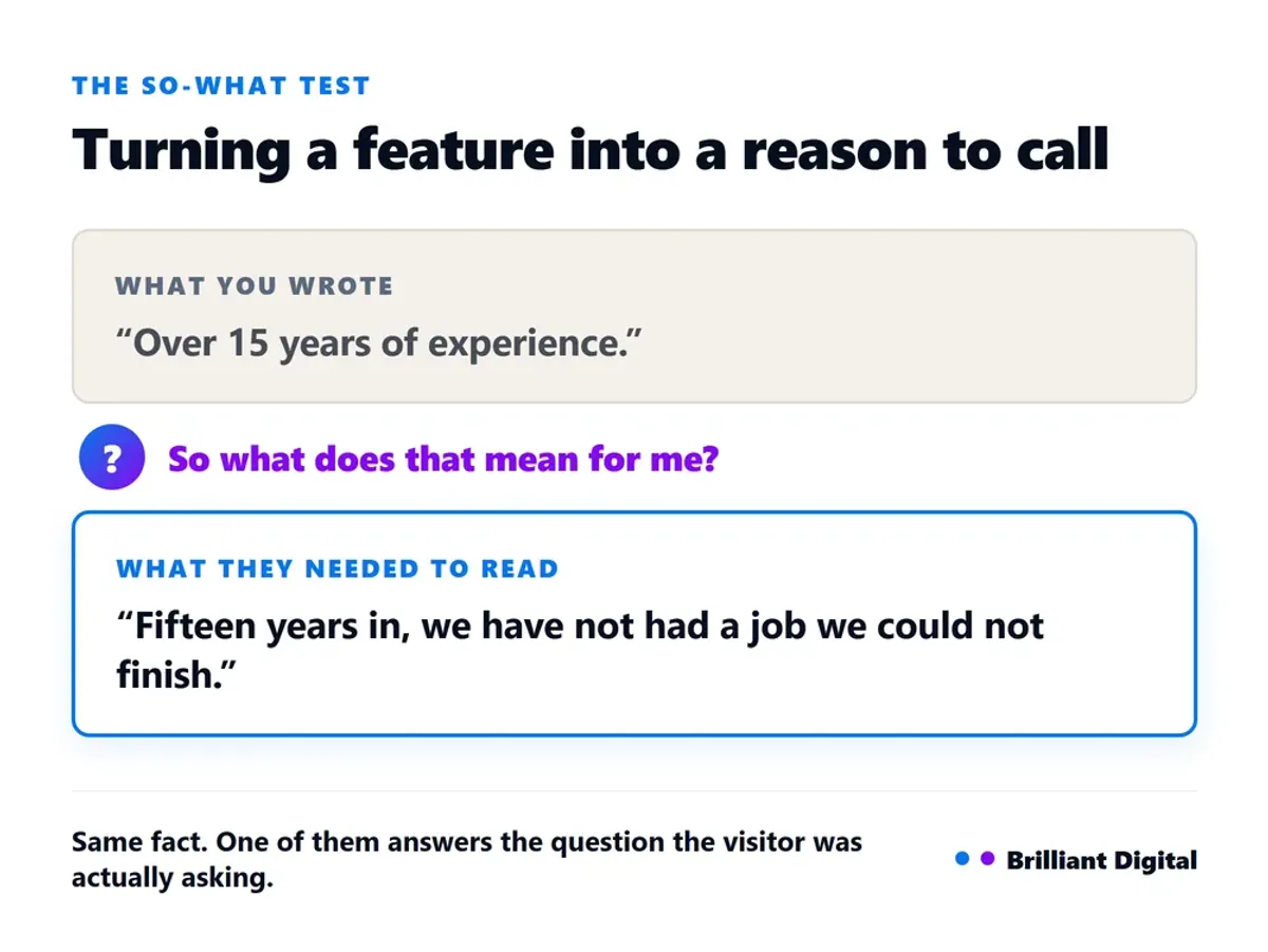
A feature is what something is. A benefit is what it does for the reader. The translation is mechanical, not creative: after every feature sentence, ask "so what does that mean for me?" and write the answer instead. Most websites list features and leave the reader to do the translation. Most readers will not bother.
Take a bathroom fitter's service page:
Before: "We offer a full design and installation service, with over 15 years of experience and fully qualified installers. All work is guaranteed."
After: "One team handles the design, the plumbing, the tiling and the electrics, so you are not chasing four trades and hoping they turn up in the right order. Fifteen years in, we have not had a job we could not finish. Everything is guaranteed for five years in writing."
Every fact from the "before" survives. Nothing was invented. But each one now has its "so what" attached:
- "Full design and installation service" becomes not chasing four trades, which is the thing the customer is quietly worried about.
- "Over 15 years of experience" becomes we have not had a job we could not finish, which is what the experience is evidence of.
- "Fully qualified installers" is implied by the rest and gets cut, because it is table stakes. Nobody advertises unqualified installers.
- "All work is guaranteed" becomes guaranteed for five years in writing, because a specific guarantee is a promise and a vague one is a slogan.
That last swap is the one people resist. Vagueness feels safe. It is not: a claim nobody can check is a claim nobody believes. Specificity is what separates copy that persuades from copy that merely reads well.
Try it on one paragraph now. Take any three sentences from your services page and write "so what?" after each one. If you cannot answer, the sentence is a feature with nowhere to go. If you would rather someone else did that work across the whole site, tell us about your business and we will come back honestly about what we would change.
Put your proof where the doubt is
Proof works when it sits next to the claim that triggers doubt, not on a separate page. A testimonials page is a page most visitors never open. The same testimonial placed directly beneath the promise it supports, or beside the contact form, does the job it was collected for. Move your proof to where the hesitation actually happens.
Different doubts need different social proof, so match the evidence to the worry:
- "Can they actually do this?" Photographs of real work, named case examples, the number of jobs completed.
- "Will they turn up?" Response times, review counts, how long you have been trading.
- "Am I going to regret this?" Reviews in the customer's own words, guarantees, accreditations and insurance details.
The strongest proof is specific and checkable. "Trusted by hundreds of happy customers" is worth nothing. "180+ five-star reviews" is worth something, because it can be verified. We have covered this in more depth in our guide to building website credibility with testimonials and reviews, but the placement principle is the part most sites get wrong.
Recency matters as much as placement. A wall of reviews where the newest is three years old reads worse than four reviews from this year, because the reader is not only asking whether you were good, they are asking whether you still are. If your review dates are visible, keep them fresh. If they are not visible, add them.
Names help too. "Sarah, Stamford" is a person. "S.T., satisfied customer" reads like something you wrote yourself, which defeats the point of collecting it.
One caution: do not stack all your proof in a single band halfway down the page. Spread it. Each claim should have its evidence within a screen of it.

Write a call to action people actually click
A call to action fails when it asks for effort without saying what happens next. "Get in touch" makes the reader invent the next step: how long will this take, will I be sold to, what am I committing to? A good one names the action, the outcome, and the commitment.
Three rewrites:
- Before: "Contact us." After: "Send us your measurements and we will come back with a fixed price within two working days."
- Before: "Request a quote." After: "Get a written quote. No site visit needed for most jobs."
- Before: "Learn more." After: "See what a full rewire costs for a three-bedroom house."
Each rewrite does the same three things. It says exactly what happens, it puts a boundary on the commitment, and it hints at the outcome. None of them are clever. Clever is not the goal.
Use one primary call to action per page. Two competing buttons of equal weight is a decision, and a decision is friction. Give the reader one obvious next step and repeat it rather than offering alternatives.
Answer the objection before it costs you the enquiry
The objections that stop enquiries are almost always the same three: what will this cost, what happens after I make contact, and how long will it take. Dodging them does not remove the objection, it pushes the visitor to a competitor who answers it. Put the answers on the page. If you sell online rather than taking enquiries, the same discipline separates product pages that answer the real questions from a copied supplier description.
Price is the one people avoid. The fear is that publishing numbers loses work. In practice the opposite happens: vague pricing attracts enquiries from people who were never going to afford you, and repels people who assume you are expensive because you will not say. A guide price does the filtering for you.
You do not have to publish a full price list. "Most kitchen refits we do land between £8,000 and £14,000, depending on units and appliances" tells the reader everything they need to self-qualify, and commits you to nothing.
What happens next is the cheapest objection to kill. Three lines. You get in touch, we ring you back within a day, we come out and give you a written quote. That is it. Uncertainty about the process stops more enquiries than price does, and it costs nothing to fix.
On timescales, be honest rather than optimistic. If you are booked eight weeks out, say so. The reader who needs it sooner was never your customer, and the reader who can wait now trusts you, because you told them something you did not have to.
Honesty here is not a moral position, it is a filter. It is the same reason we publish what web design costs in the UK rather than asking people to enquire to find out.
Two frameworks worth knowing: PAS and AIDA
Two frameworks cover almost every page a small business needs. PAS (Problem, Agitate, Solution) suits service pages, where the reader already knows something is wrong. AIDA (Attention, Interest, Desire, Action) suits homepages, where you have to earn attention before anything else. Both give you a running order, which is usually what a blank page is missing.
PAS works like this. Name the problem in the reader's words. Show what it costs them to leave it alone. Then present what you do as the answer. A damp specialist's page might open with the tide mark on the wall, move to what happens to plaster and skirting if it is ignored for another winter, then explain the survey.
AIDA is for the top of the funnel. Attention comes from a headline that stops the scroll. Interest comes from specifics that prove you understand the situation. Desire comes from showing what "sorted" looks like. Action is the one clear next step.
Two honest caveats. A framework is a scaffold, not a script, and copy that follows one too rigidly reads like a template. And agitation has a limit: naming a real cost is useful, manufacturing fear is not, and readers can tell the difference immediately.
We have been building and writing websites since 2014, more than 150 of them, and the pattern is consistent. The sites that generate enquiries are rarely the most beautiful ones. They are the ones where somebody sat down and worked out what the visitor needed to read.
Frequently Asked Questions
What are the 7 C's of a website?
The seven C's are commonly listed as content, context, clarity, consistency, credibility, conversion and communication. They are a memory aid rather than a standard, and the useful ones for copy are clarity, credibility and conversion: say it plainly, prove it, and tell the reader what to do next.
How much copy does a small business website need?
Enough to answer the questions that stop someone enquiring, and no more. A service page usually needs 500 to 900 words. Length is not the target. If you are padding to hit a number, you are adding sentences a reader will skim past on their way to the button.
Should I write my own website copy or hire someone?
Write it yourself if you know your customers' objections and can be ruthless about cutting. You have the raw material nobody else does. Hire someone if you cannot get outside your own expertise, which is common and not a failing. Many businesses write the first draft and pay someone to sharpen it.
How often should I update my website copy?
Review your main pages once a year, and immediately whenever your services, prices or ideal customer change. If a question keeps arriving by email, add the answer straight away. Copy that no longer matches what you actually sell is worse than copy that is simply old.
Does AI-written website copy work?
It works for structure and first drafts, and it fails at the part that matters. AI does not know your enquiry inbox, your customers' exact words, or the objection you handle on every call. Used as a starting point it saves time. Published unedited, it reads like everyone else.
What to do next
Start with one page, and start with your homepage. Read the whole thing aloud, slowly. Mark every sentence that could sit unchanged on a competitor's website, then rewrite the headline using the formula: what you do, who it is for, and the outcome they get. Fix that one line before you touch anything else.
Work through the rest of your pages using the pages your website needs as a checklist. Once the words are right, make them scannable: short paragraphs, informative subheadings, and bullets wherever you have listed three things in a row. Our guide to structuring website content covers that side of it.
If you would rather have it done properly, that is what our web design service covers. We write the copy as part of the build, because a website that looks good and says nothing is not finished. Tell us about your business and what you want it to do, and we will come back honestly about what we think. No lengthy proposal, no hard sell.