Most business owners think they have a good website because it looks alright. And that is an understandable assumption. The design is clean, it works on mobile, the logo is in the right place. But looking alright and generating enquiries are two very different things.
At Brilliant Digital, we have built over 150 websites since 2014. The pattern is consistent: some sites generate steady enquiries from day one; others sit there doing very little. The difference comes down to a specific set of factors. Not luck. Not budget. Not the size of the business. This guide covers every one of those factors, in the order that matters.
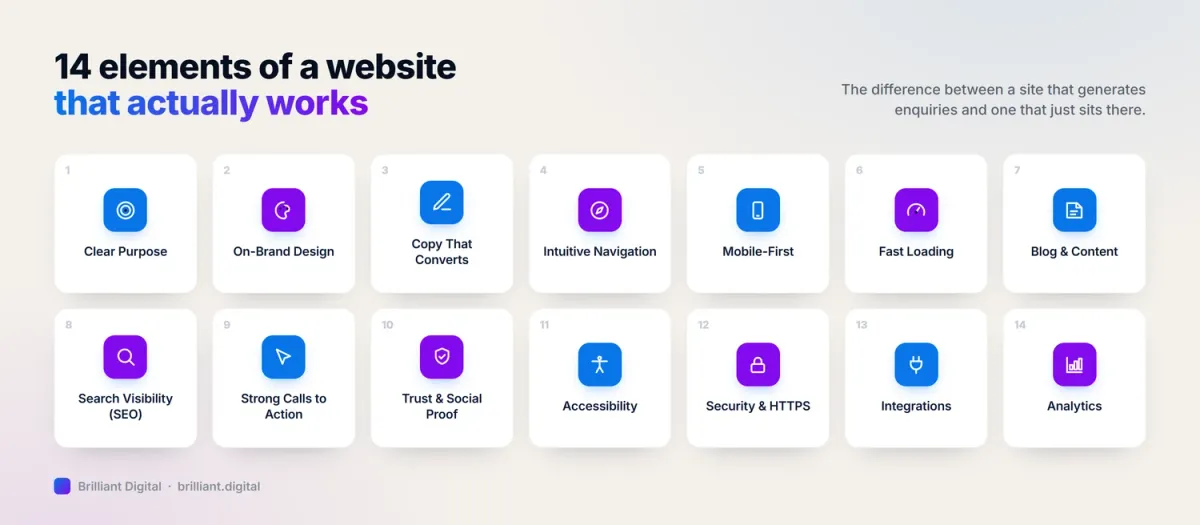
A good website has a clear purpose, a design that reflects the brand, copy that persuades rather than just informs, fast loading speeds, and content that gives visitors what they need. It works equally well on mobile and desktop, earns visibility in search results, and guides visitors towards a specific action, whether that is making an enquiry, booking a call, or buying a product.
Key Takeaways
- A good website has one clear purpose per page and makes it obvious within seconds what the business does, who it serves, and what to do next.
- The copy on your website matters as much as the design. Informational text that lists services will not convert. Marketing copy that speaks to problems and benefits will.
- Mobile performance is not optional. Over 60% of web traffic is on mobile, and Google ranks mobile performance first when deciding where your site appears in search results.
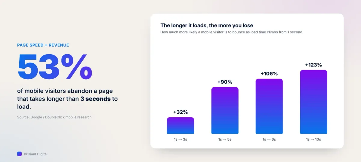
- Page speed directly affects revenue. More than half of mobile visitors abandon a page that takes longer than three seconds to load.
- Trust signals, including testimonials, case studies, and review badges, are not decoration. They are the difference between a visitor staying or leaving.
- The most common reason a good-looking website fails to convert is the absence of a clear call to action and a frictionless way to get in touch.
1. A Clear Purpose and Business Goal
A good website knows exactly what it is trying to achieve, and it makes that obvious to every visitor within seconds.
The homepage has one job: answer three questions immediately. What do you do? Who is it for? Why should I trust you? If a visitor has to read three paragraphs to work out what your business actually does, the website has already failed.
Most websites bury their purpose under a headline that says something like "Passionate about your success" or "Welcome to our website." These tell the visitor nothing. A business that sells commercial cleaning services should say "Commercial cleaning for offices and facilities across the East Midlands" in the first line, not something poetic about freshness and care.
Every page on the site needs its own purpose too. The services page should move visitors toward an enquiry. The about page should build credibility. The blog should answer questions and demonstrate expertise. We plan the goal of every page before we write a single word or place a single element. That is how you build a website that works rather than one that merely exists.
If you are assessing your own site, the 7 pages you need for a successful website is worth reading alongside this guide.
2. Professional, On-Brand Design
Design is not about personal taste. It is about trust and first impressions.
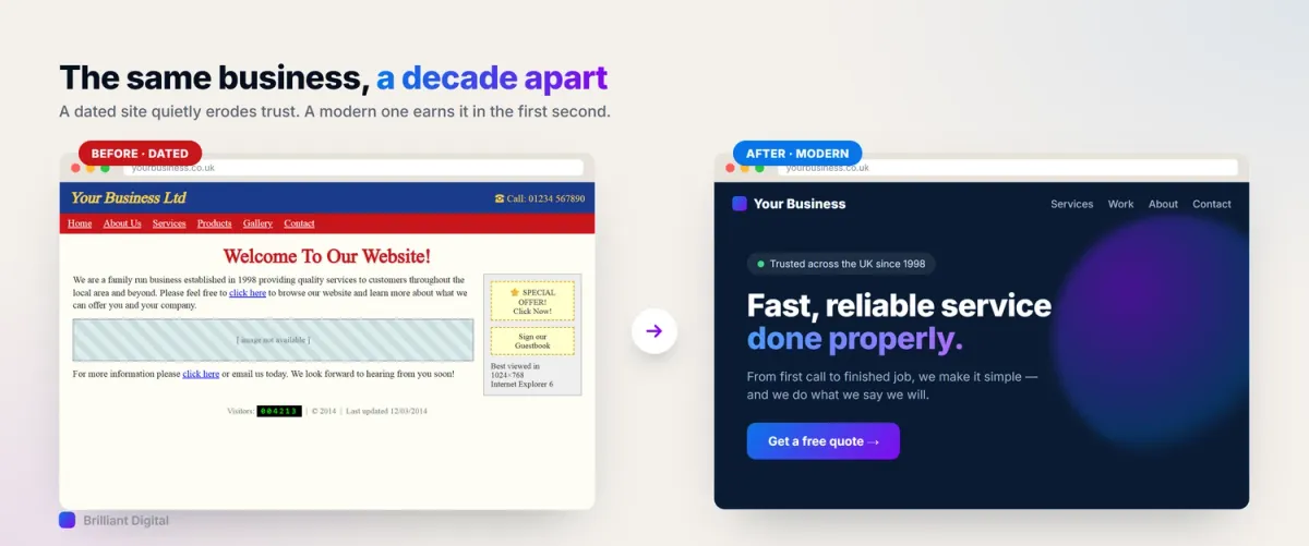
Visitors form a judgement about a website in under a second. A dated design, inconsistent colours, or low-quality photography signals that a business does not take its online presence seriously. Whether that impression is fair or not, it happens.
Brilliant Digital's position is straightforward. Design serves business outcomes, not aesthetics. We are not building websites to win design awards. We are building websites that reflect the brand accurately, communicate trustworthiness immediately, and direct visitors towards the right action. A design that achieves all three is a good design, regardless of how it compares to the latest Awwwards trends.
The practical elements that matter: consistent use of the brand's colours and fonts, high-quality photography (no blurry images, no generic stock shots of people shaking hands), adequate whitespace to make content readable, and a visual hierarchy that guides the eye from headline to key information to CTA.
If your existing site no longer reflects your business accurately, when to rebrand your website covers the signals that it might be time for a change. You can also see examples of what this looks like in practice across our client portfolio.
3. Website Copy That Converts
Most business websites have a content problem that has nothing to do with grammar or spelling. The words are fine. The sentences make sense. But nobody reads past the first paragraph, and nobody picks up the phone afterwards.
The issue is that most website copy is written to inform rather than to persuade. It describes what the business does, lists its services, and explains its process. All factually correct. All completely forgettable. A visitor reads "We provide comprehensive digital marketing solutions tailored to your business needs" and moves on to the next tab, because that sentence could belong to any business in any industry.
Copy that converts starts with the reader's problem, not the business's credentials. It speaks to what the visitor is worried about, what they have tried before, and what they actually want to happen. Then it positions the business as the answer, backed by proof.
The difference looks like this. Informational copy: "We offer professional web design services for businesses of all sizes." Conversion copy: "Your website should be your best salesperson. If it is not generating enquiries every week, something is wrong, and it is almost certainly fixable." The first describes. The second connects.
Google's E-E-A-T framework (Experience, Expertise, Authoritativeness, Trustworthiness) reinforces why this matters. Search engines are increasingly able to assess whether content comes from genuine experience or is generic filler. Copy that includes specific examples, real outcomes, and practical detail signals expertise. Copy that repeats the same vague claims as every competitor signals nothing.
This is exactly why we now write the marketing copy for every website we build, included in the project from the start. We kept seeing the same pattern: a well-designed, fast, technically solid website that generated almost no enquiries, because the copy read like an internal document rather than a conversation with a potential customer. The design gets visitors to the page. The copy is what makes them stay, read, and act.
If your website has not had its copy professionally written or reviewed, it is almost certainly underperforming. If you want the method rather than the principle, our guide on how to write copy that gets enquiries works through the before-and-after rewrites in full.
4. User Experience and Intuitive Navigation
Visitors should never have to think about how to find something.
Good UX is invisible. Visitors move through the site naturally, find what they are looking for without frustration, and arrive at the right place. Bad UX is immediately noticeable: menus with ten items all given equal weight, page titles that do not match what the page contains, contact information buried in a footer nobody scrolls to.
Research published by Google found that 38% of users stop engaging with a website if the layout is unattractive or hard to use. That is more than a third of your visitors leaving because the experience felt wrong, not because your product or service was unsuitable.
The key UX principles for business websites:
- Clear menu structure with no more than five or six primary items. If your navigation requires a dropdown within a dropdown, it needs rethinking.
- Logical page hierarchy, so visitors can predict where things live.
- Consistent navigation patterns across all pages, so users do not have to relearn the structure as they move through the site.
- Contact information that is never more than one click away.
- Search and breadcrumbs on larger sites, so users can navigate without backtracking.
We map user journeys before we build menus. The question is always: what is this visitor trying to do, and how many steps does it take? Fewer steps, clearer labels, and an obvious path to the goal. That is good UX.
5. Mobile-First Responsiveness
More than 60% of web traffic is now on mobile. Google uses mobile performance as its primary ranking signal. If your website performs poorly on a phone, it performs poorly in search results.
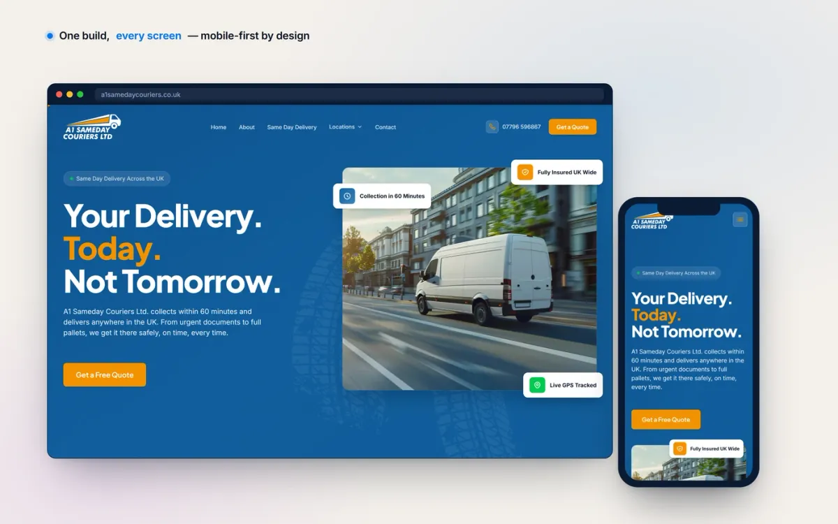
"Mobile-responsive" is sometimes misunderstood to mean "it doesn't break on a phone." That is a very low bar. A truly mobile-first website is designed for mobile first and then adapted for larger screens, not the other way around.
A site designed for desktop first often has issues that are easy to miss on a large screen: tap targets that are too small to hit accurately with a thumb, text that requires pinching to read, images that scale incorrectly, forms that are awkward to fill in on a touchscreen.
Google's Core Web Vitals framework measures real-world performance across three metrics: loading speed, responsiveness to input, and visual stability. Mobile scores are the ones that matter most for rankings, and a website that does not meet these benchmarks is penalised regardless of how well it performs on desktop.
Every website we build at Brilliant Digital is designed on mobile first, then expanded to desktop.
6. Fast Loading Speed
Every extra second of loading time reduces conversions. This is not a general principle. It is a measurable fact.
Google's research found that 53% of mobile visits are abandoned if a page takes longer than three seconds to load. If your site takes four seconds on mobile, more than half your visitors leave before they have seen a single word of content.
The business impact compounds. A slow site loses visitors. Fewer visitors means fewer enquiries. Fewer enquiries means slower growth. Meanwhile, search engines also penalise slow sites, reducing organic traffic in the first place.
What causes slow websites? The most common culprits are:
- Unoptimised images, the single biggest factor on most business sites
- Heavy WordPress plugins that load scripts and stylesheets on every page
- Shared hosting with inadequate resources for the traffic the site receives
- Outdated code that has not been modernised or refactored
- Third-party scripts (analytics, chat widgets, tracking pixels) that load before the main content
Google's Core Web Vitals documentation explains the performance metrics in detail. For practical steps you can take right now, our guide to improving website performance covers the fixes that make the biggest difference.
At Brilliant Digital, we build on Astro and Cloudflare. Astro generates static HTML by default, eliminating the performance overhead of WordPress. Cloudflare serves content from a global network, so the site loads quickly regardless of visitor location. The result is sub-second load times. Our web design services page explains this in more detail.
7. Blogging and Content Marketing
A website's core pages get visitors through the door. A blog and a content marketing strategy give them a reason to come back, and give search engines a reason to keep ranking you.
A business website without a blog is relying entirely on its service pages to attract organic traffic. That limits visibility to the handful of keywords those pages target. A blog that answers real questions, explains industry topics, and shares case studies opens up dozens of additional search terms that potential customers are actively searching for. Each article is another entry point to the business.
But publishing blog posts without a strategy is not content marketing. Content marketing means having a plan: knowing which topics your audience cares about, which keywords are worth targeting, how often to publish, and how each piece connects to the wider business goals. A blog that publishes one article and then goes silent for a year is worse than no blog at all, because it tells visitors the business started something and gave up.
Content should also serve the wider marketing strategy. Blog posts can be repurposed into social media content, email newsletters, and downloadable guides. A single well-researched article can generate weeks of material and drive traffic long after it was published.
If you want to understand how to build a content plan, our guide to content marketing strategy for small business covers the practical steps. For structuring individual pages and posts, mastering website content structure is also worth reading.
8. Search Engine Optimisation (SEO)
A good website needs to be found. Building a website that performs well for visitors but is invisible to search engines means the only people who see it are the ones who already know you exist. That is the real cost of treating SEO as optional, and it is worth understanding why SEO matters for small businesses before you decide how much of it your site needs.
SEO is the process of helping search engines understand what your website is about and matching it with the right searches. For business websites, the basics are accessible, and getting them right makes a genuine difference.
The on-page SEO fundamentals:
- Title tags and meta descriptions, the text that appears in search results, should be specific, accurate, and include the main keyword for each page.
- Header structure (H1, H2, H3 tags) should reflect the page's actual hierarchy, not be used at random for styling purposes.
- Image alt text should be descriptive, both for accessibility and for search engines.
- Internal links between your own pages help search engines understand how your content relates and distribute ranking strength across the site.
For service businesses, local SEO matters enormously. Appearing in search results for "[your service] in [your location]" requires specific on-page and off-page signals, including a well-maintained Google Business Profile.
For practical next steps, how to improve your Google rankings covers the actions that make the biggest difference. If you want to build a long-term plan, our guide to creating an SEO strategy walks through the process step by step.
9. Calls to Action, Lead Magnets, and Contact Experience
Every page on your website should have one primary action it wants the visitor to take.
A call to action, or CTA, is the instruction that moves a visitor from reading to doing. "Get a free quote." "Book a consultation." "Download the guide." Without a clear CTA, visitors who are interested in what you offer have no obvious next step. They drift away.
The most common mistake is not the absence of a CTA but the absence of a clear, prominent one. Many websites have CTAs, but they are small, buried at the bottom of the page, or competing with three other equally weighted options.
CTA effectiveness depends on three things:
- Placement. Above the fold on key pages, and repeated at the natural end of long-form content.
- Language. Specific and benefit-focused. "Get your free website review" performs better than "Submit."
- Visual hierarchy. The CTA should be visually distinct, whether through colour, size, or surrounding whitespace, so the eye is drawn to it naturally.
Not every visitor is ready to make an enquiry on their first visit. This is where lead magnets earn their value. A free website audit, a downloadable checklist, or a pricing guide gives visitors a reason to leave their contact details even when they are not ready to commit. The business gains a lead it can nurture. The visitor gains something useful.
The contact experience matters just as much as the CTA. A "Get in touch" button that opens a form with fifteen fields will kill the conversion the CTA just earned. Keep forms short: name, email, and a brief message is usually enough. Offer multiple contact methods, whether that is phone, email, form, or live chat, so visitors can reach you in the way they prefer.
For a deeper look at what drives enquiries, our guide to maximising website conversion rates covers the full picture.
A website without a clear CTA is a brochure, not a business tool. A website with a clear CTA but a poor contact experience is a funnel with a hole in the bottom.
10. Trust Signals and Social Proof
Visitors are sceptical on a first visit. They do not know you. They cannot assess your work in person. They are making a judgement about whether to trust a business they have never encountered before, based entirely on what they can see on your website.
The most effective trust signals for business websites: genuine testimonials placed next to the claims they support, not collected on a single page that nobody reads. Case studies with real results and real numbers. Star ratings and review badges from Google or Trustpilot. And an about page that features real people with real names and photographs, not corporate stock images.
We have 180+ five-star Google reviews, earned over more than a decade of client work. But those reviews only serve their purpose when visitors can see them. Placing trust signals strategically throughout the site, on service pages, on the homepage above the fold, within the contact form page, is how they do their job.
For a detailed guide on making trust signals work harder, see how to get and use customer testimonials.
11. Accessibility
A good website works for everyone, including the estimated 16 million people in the UK who live with a disability.
Web accessibility means building a site that can be used by people with visual impairments, motor difficulties, hearing loss, and cognitive differences. It is also a legal obligation. The Equality Act 2010 requires businesses to make reasonable adjustments so that disabled people are not placed at a substantial disadvantage when using their services. Your website is one of those services.
Beyond compliance, accessibility improvements benefit all users. High-contrast text is easier to read in direct sunlight. Clear heading structures help everyone scan content quickly. Keyboard navigation benefits power users as much as those who cannot use a mouse.
The Web Content Accessibility Guidelines (WCAG) set the international standard. For most business websites, meeting WCAG 2.1 Level AA is the appropriate target. The practical requirements include:
- Sufficient colour contrast between text and background
- Descriptive alt text on all images
- A logical heading hierarchy
- Forms with properly labelled fields
- Full keyboard navigability
Accessibility also overlaps significantly with SEO. Descriptive alt text, semantic HTML, and clear heading structures are the same signals that help search engines understand and rank your content.
Every website we build at Brilliant Digital is tested against WCAG 2.1 AA standards before launch.
12. Security and HTTPS
A padlock icon in the browser bar is now a minimum expectation. A website that shows "Not secure" in the address bar is immediately losing trust, even among visitors who do not know exactly what HTTPS means.
HTTPS encrypts the connection between the visitor's browser and your website. Any data they submit, whether contact form details, payment information, or email addresses, cannot be intercepted in transit. Without it, that data is transmitted in plain text.
If your website collects any personal data from UK visitors, including through a contact form, you are legally obligated to handle it securely under GDPR. Modern hosting platforms have made HTTPS straightforward. On every website we build, SSL certificates are handled automatically with no manual renewal required. For more detail, GDPR compliance for websites covers the practical obligations.
13. Integrations and Functionality That Do the Work
A good website does more than describe a business. It does work for it.
The best business websites are connected to the systems the business actually runs on. A booking or appointment tool that lets customers reserve a slot without a single phone call. A payment gateway that takes deposits or sells products directly. A contact form that pushes enquiries straight into a CRM or inbox, so nothing slips through. Live chat for visitors who want an answer now. Newsletter sign-ups that feed an email marketing platform automatically.
Every integration removes a manual step. Instead of a member of staff retyping enquiry details, chasing a booking, or copying an email address into a mailing list, the website handles it. That is the difference between a website that merely looks busy and one that genuinely saves time and captures revenue while you sleep.
The technical side matters just as much. Integrations should be reliable, secure, and fast. A chat widget or booking script that drags the whole page down, or a form that silently fails, does more harm than no integration at all. We build integrations to be lightweight and to fail safely, so an enquiry is never lost because a third-party script had a bad day.
When we scope a website at Brilliant Digital, we ask what happens after an enquiry arrives, and we build the site to feed that process. A website that plugs into the way you already work is a website that earns its keep. Our web design services are built around exactly that principle.
14. Analytics and Continuous Improvement
A good website is never truly finished. The best websites improve continuously based on real data.
Most business owners have Google Analytics installed but very few actually use it. The data is there, but without someone reviewing it, it does not help anybody. The most useful things to monitor:
- Traffic by source, so you know whether visitors are finding you through search, social media, direct visits, or referrals.
- Top pages, so you know which content is doing the most work.
- Bounce rate and session duration on key pages, to identify where visitors are losing interest.
- Goal completions, whether that is form submissions, phone number clicks, or email address clicks.
- Google Search Console, which shows exactly what searches your site appears for and what content is gaining or losing ground.
We include analytics installation and a handover session as standard on every new site build, so clients know what to watch from day one. Even small improvements compound over time. A clearer CTA, a faster hero image, a testimonial added to a bare services page: each change is small, but they accumulate into a measurably better performing website over months.
What Makes a Website Bad?
Before benchmarking against the qualities above, check whether your site fails on any of the fundamentals. The most common failure patterns are not obscure technical problems. They are basic structural issues that are surprisingly common.
- A cluttered homepage with no clear message. Too much text, too many images, too many options, and no obvious focal point. Visitors are overwhelmed and leave.
- Navigation that requires guessing. Menu items labelled with internal jargon ("Our Offer", "The Hub", "Transform") that mean nothing to a first-time visitor.
- Missing or buried contact information. If a visitor cannot find your phone number or contact form within ten seconds, you have lost them.
- No mobile optimisation. Text too small to read, images that overflow the screen, buttons that cannot be tapped accurately. This is not acceptable at any price point.
- Fake-looking stock photography. Images of people in suits shaking hands in an empty conference room do not build trust. Real photographs of real people and real work are always more effective.
- Slow load times. If you have been told your site is "fast enough," test it yourself. Open your homepage on a mobile connection and count the seconds.
- Copy that describes instead of persuading. Pages full of "we provide" and "our services include" that read like an internal document. If a visitor cannot see themselves in the copy, they will not read it.
- Missing calls to action. Beautiful service pages with no "get in touch" button. Detailed pricing information with no next step.
- Outdated design that erodes trust. A website last updated in 2017 tells visitors that the business is not keeping up. It may be unfair, but it affects their decision.

Frequently Asked Questions
What are the most important qualities of a good website?
The most important qualities are clarity of purpose, persuasive copy, mobile performance, fast loading speed, and clear calls to action. A visitor should know what the business does within seconds, feel that the business understands their problem, be able to use the site easily on any device, and have an obvious next step whenever they are ready to act.
How do I know if my website is good?
The most reliable test is whether your website generates enquiries consistently. Check these basics: does the homepage explain what you do within seconds? Does the copy speak to your customer's problems or just list your services? Does the site load in under three seconds on mobile? Are calls to action clear on every service page? Google Search Console and PageSpeed Insights (both free) give you technical data to go alongside that judgement.
What makes a website look professional?
Professional design comes down to consistency, quality, and restraint: consistent colours and fonts throughout, high-quality photography of real work or real people, adequate whitespace, and a visual hierarchy that guides the eye. Meeting accessibility standards (WCAG 2.1 AA) also contributes to a more polished, trustworthy appearance, because accessible design is clean, well-structured design.
How often should a website be updated?
Key content should be reviewed at minimum once a year, and updated whenever the underlying information changes. Security certificates and platform updates should be maintained continuously. The most common mistake is treating the website launch as the finish line. A site that accurately reflects your current business will always outperform one that was perfect on launch day but unchanged for three years.
What makes a website bad?
The most common causes are: no clear purpose on the homepage, copy that informs rather than persuades, confusing navigation, missing or buried contact information, slow loading speed on mobile, no calls to action, outdated design, generic stock photography, and no trust signals such as testimonials or case studies. The good news is that most of these are fixable without a complete rebuild.
Is Your Website Making the Grade?
Running through this list against your own website is a useful exercise. Most business owners find two or three areas where their site is clearly underperforming, and at least one where a relatively small change would make a meaningful difference.
If you would like a second opinion, we offer a free, no-obligation website review. We look at design, copy, performance, and conversion, and we tell you honestly what is working and what is not. No sales pitch. Just a straight assessment of where your website stands and what the realistic options are.
We have been building and improving business websites since 2014, with 150+ sites built and 180+ five-star reviews from the clients we have worked with. If your website should be generating more enquiries than it currently does, get in touch and we will take a look.
You can also explore our web design services to understand what a modern, performance-built website looks like from the ground up.